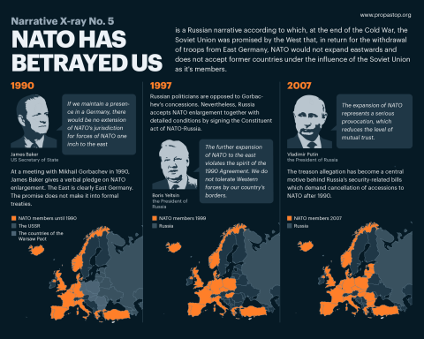
While a map is usually defined as a reduced representation of reality, one part often goes unmentioned: maps can also be used to distort reality, depicting a situation from precisely the angle that suits oneself. The apparent objectivity of maps makes them an excellent tool for spreading propaganda, reducing long arguments to lines or dots on a map. Maps create a powerful visual narrative that appears not as opinion, but as science. Russia, too, actively uses cartography-based propaganda to spread its narratives both domestically and internationally.

An already historical method
Propaganda through maps is certainly not a new phenomenon. Russia, for instance, already used map-based propaganda in the Tsarist era, when the publication of the “Russian Atlas” was begun on the initiative of Peter I, which became the main source of information for Western countries in their depictions of Russia. Before long, maps appeared in the West in which the territories of present-day Ukraine were labelled “Little Russia”.
During the Cold War, too, both sides used map-based propaganda. As various techniques, one could depict one’s own country as, for example, peaceful and innocent, threatened without cause by the opposing side – or, conversely, depict oneself as large and strong, and the other side as weak, decayed and fragmented.
For example, the map pictured here, published by the French Communist Party in 1951, depicts the Soviet Union as an innocent victim and the United States as an aggressor. The accompanying text describes how two million American soldiers are preparing to wage war in every country of the world with all their military hardware, while Soviet soldiers have not fired a single shot abroad since defeating Hitler. “Who is the aggressor? Who is threatening?” reads the rhetorical question in large letters.
The Russian Geographical Society

Today, cartography-based propaganda in Russia is largely handled by the Russian Geographical Society, founded in 1845. For a long time the organisation did not spread Kremlin narratives to any great extent, but a major shift came with the Russian aggression against Georgia that began in 2008. The society began circulating maps in which occupied areas were depicted either as parts of Russia or as so-called “disputed territories”. Today the Russian Geographical Society is one hundred percent part of the Kremlin, with Sergei Shoigu as its president and Vladimir Putin as chairman of its board of trustees.
Since Russia’s invasion of Ukraine in 2014, the Russian Geographical Society has diligently forged ties with foreign organisations in countries such as China, Turkey, Germany, Italy, the United States and others. These international connections have helped the society spread propaganda beyond Russia’s borders as well. National Geographic, for example, has depicted Crimea in a variety of ways on its maps. Alongside the correct treatment, it has also shown Crimea as, say, an area of Russia that Ukraine claims as its own; as fully part of Russia; and as a separate territory belonging to neither Ukraine nor Russia.
Maps and education

The education system plays an important role in spreading propaganda through cartography. In both its own schools and the occupied territories of Ukraine, Russia uses textbooks whose maps mark occupied Ukrainian areas as Russia’s “new regions”.
Such propaganda, however, is not confined to Russia and the areas it occupies. Maps and globes that depict Ukrainian areas as part of Russia are also distributed across Western Europe through various major publishers.
The Ukrainian activist Mykola Holubey, for example, studied maps, globes and brochures sold in Germany and identified dozens of cases in which Ukrainian areas were marked as belonging to Russia.
Propaganda online
In today’s digitalised world, paper maps play an ever-diminishing role. Map-based propaganda has therefore migrated to the internet as well.
Platforms such as Natural Earth and OpenStreetMap depict the Ukrainian territories occupied by Russia as part of Russia.
Probably the most widely used online mapping application, Google Maps, displays the map differently depending on the person’s location. To a Russian IP address, for instance, Google shows Crimea as part of Russia; to a Ukrainian IP address, as part of Ukraine; and viewed from within the European Union, as an area demarcated by dashed lines.

Attempts have also been made to circulate videos claiming that, when searching for Ukrainian cities in Google Maps, the name of Ukraine is no longer displayed beside the city’s name – as if the city belonged to no country at all. In reality, however, Google Maps does not display a country’s name beside a city’s name when the searched city lies in the same country from whose IP address the search was carried out.
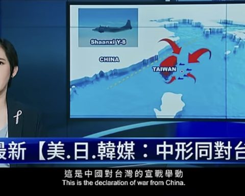
Maps are also frequently used as a basis for creating so-called infographics, through which one can convey whatever narratives suit oneself. Before the full-scale invasion of Ukraine, for example, Russian state media claimed that biological weapons were being developed in the country with the support of the United States. Once again, the map renders the claims visual and easily digestible. Maps appear precise and scientific to people, which is why anything placed on a map can seem true.
When speaking of map-based propaganda, one cannot overlook the depiction of the battlefield.
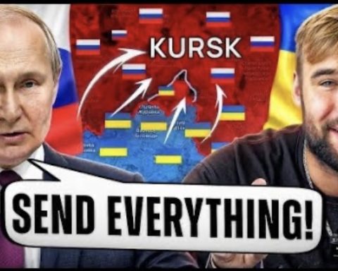
In the first weeks of the invasion, Russian channels published maps that marked far more occupied territory than actually existed. The aim was to show that Russia’s blitzkrieg-style “special operation” was succeeding. Since the advance of Russian forces has slowed considerably compared with the start of the war, map manipulation now takes place on a smaller scale as well.
Conclusion

Propaganda through cartography is not a new technique. Both Russia itself and numerous companies located abroad spread narratives favourable to Russia through maps.
On the one hand, a map appears objective and scientific, which helps to present Russia’s positions as “fact”. On the other hand, occupied Ukrainian areas are depicted in differing ways on different maps. This, too, suits Russia, because it creates the impression that “there is no clear truth in the matter” and that “this is a complicated question”.
Maps are not always neutral versions of reality, but political tools that help spread one’s own positions. It must be understood that maps reflect the views and interests of their creator, and therefore do not always convey truthful information.